Form UX Best Practices: Reduce Friction, Increase Conversions
81% of users abandon forms. Here's how to fix field count, label placement, validation, mobile design, and progressive disclosure without sacrificing spam protection.
Your contact form is bleeding money. Not because of bad copy or weak CTAs. Because of friction you probably don’t even notice.
Here’s the thing: 81% of people have abandoned a web form at some point. About a third of visitors who start filling out your form never finish. And the average abandonment happens at 1 minute 43 seconds. That’s how long you have before users bail.
The good news? Most form UX problems are fixable. The bad news? You’re probably making at least three of the mistakes we’re about to cover.
The Field Count Myth (And What Actually Matters)
“Keep it to five fields or fewer.” You’ve heard this a thousand times. It’s become gospel in conversion rate optimization circles.
But here’s the plot twist: reducing fields doesn’t always increase conversions. Sometimes it tanks them.
Wait, what?
The relationship between field count and conversion rates is messier than the best practices suggest. Yes, every additional field creates friction. But removing fields that help qualify leads means you end up with more spam and junk submissions. Your sales team wastes hours filtering garbage instead of closing deals.
The real question isn’t “how few fields can I get away with?” It’s “which fields are worth the friction?”
A Baymard study found that 18% of users abandon checkout forms because the process was “too long or complicated.” But that same research shows users will happily fill out longer forms when they understand why each field matters.
Here’s the framework that actually works:
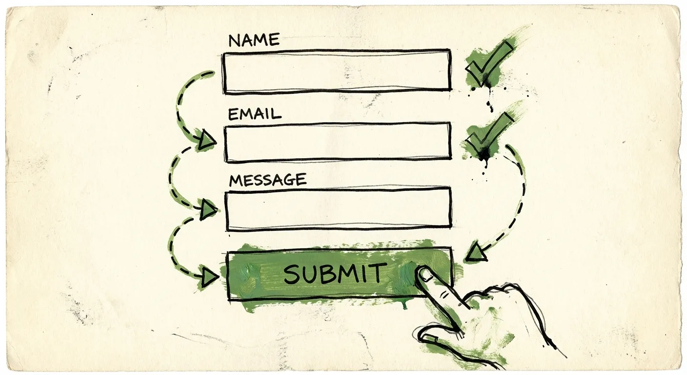
Essential fields stay. Name, email, message for a contact form. These earn their friction.
Nice-to-have fields get cut. Do you really need their company size on the first touchpoint? Probably not.
Context-dependent fields get conditional logic. Show the phone number field only after they’ve indicated they want a call back.
Instead of asking for a full address, just ask for a ZIP code. Instead of requiring a phone number upfront (which causes 37% of users to abandon), make it optional or ask later. Every field should justify its existence.
Label Placement: The Eye-Tracking Evidence
Where you put your labels isn’t a style choice. It’s a usability decision backed by eye-tracking research.
Labels above fields are almost 5x faster for users to process than labels beside fields. That’s not a typo. Five times.
Eye-tracking studies from UXmatters found that placing labels directly above input fields lets users capture both elements in a single eye movement. Labels beside fields force a Z-pattern scan that slows everything down.
On mobile, this becomes even more critical. When a user focuses on a field, the keyboard takes up half the screen. If your label is beside the field instead of above it, there’s a good chance it gets cropped out entirely. The user forgets what they’re supposed to enter.
Baymard’s mobile checkout research is clear: labels above fields allow form inputs to extend full width, and you’re not limited to one or two word labels.
There’s one exception. For short, logically grouped fields like City and State, side-by-side placement on the same row can work. But even then, labels go above each field, not beside.
What about floating labels? Those trendy animations where the placeholder transforms into a label when you click? They look slick in Dribbble shots, but they’re accessibility nightmares. The tiny floating text is hard to read, and screen readers often struggle with them. Skip the fancy animations. Put your labels above your fields and move on.
Error Handling That Doesn’t Make Users Rage-Quit
Nothing tanks form completion rates faster than bad validation. You know the experience. You carefully fill out a form, hit submit, and the page reloads with a cryptic red message at the top. Now you have to hunt through 12 fields to find the one that failed validation.
This is after-submission validation, and it sucks.
Luke Wroblewski’s research on inline validation showed dramatic improvements over submit-and-pray: 22% increase in success rates, 22% decrease in errors, 31% increase in satisfaction, 42% faster completion times.
But inline validation has a trap. If you validate too aggressively, you interrupt users mid-thought. Nothing’s more annoying than seeing “Invalid email” flash while you’re still typing your email address.
The solution is what Smashing Magazine calls the “reward early, punish late” pattern:
- Validate on blur (when users leave a field), not on keystroke
- Show success states immediately - that green checkmark is motivating
- Delay error messages until users have finished typing
- Clear error messages in real-time once the user fixes the issue
One more thing: be flexible about formatting. Your phone number field should accept (555) 123-4567 and 5551234567 and 555-123-4567. Don’t make users guess which format you want. Parse the input and normalize it yourself.
And please, write error messages like a human. “Invalid input” tells users nothing. “Please enter a valid email address like name@example.com” actually helps.
Mobile Form Design: Designing for Thumbs
Over 58% of web traffic now comes from mobile devices. Your forms aren’t optional mobile features anymore. They’re primary interaction points.
And yet most developers still design forms on 27-inch monitors, then wonder why mobile conversion rates tank.
The thumb zone concept changed how we think about mobile design. Most people hold phones one-handed and tap with their thumb. There’s a natural arc of comfortable reach. Anything outside that arc requires awkward finger gymnastics or two-handed use.
Where does this matter for forms?
Submit buttons belong at the bottom center. That’s prime thumb real estate. Putting your CTA in the top corner of a mobile form is conversion suicide.
Touch targets need to be at least 48x48 pixels. Thumbs are fat and imprecise compared to mouse cursors. Tiny form fields and buttons cause mis-taps and frustration. Research from Heyflow shows that design adjustments aligned with natural thumb movements can increase form completion by 35%.
Single-column layouts only. Multi-column forms might look efficient on desktop. On mobile, they force horizontal scrolling or create cramped, error-prone fields. Stack everything vertically.
Use the right input types. When a field expects a phone number, use type="tel" to trigger the numeric keypad. For email, use type="email" to get the @ key. For dates, use native date pickers instead of making users type 01/15/2024. These small touches make mobile forms dramatically faster to complete.
Enable autofill. Mobile form statistics show browser autofill increases completion rates by 25% and makes the process 30% faster. Use proper autocomplete attributes so browsers can pre-fill name, email, address, and payment details.
One more mobile-specific issue: avoid dropdowns when possible. On mobile, dropdowns open full-screen pickers that obscure context. If you have 3-5 options, radio buttons or segmented controls are faster. Save dropdowns for genuinely long lists like country selection.
Progressive Disclosure: Stop Overwhelming Users
Here’s a scenario. Your lead form needs 15 data points to properly qualify prospects. Marketing wants all 15. Users take one look at the wall of fields and bounce.
Progressive disclosure solves this by breaking complex forms into digestible chunks.
Multi-step forms (sometimes called wizard forms) divide input fields into logical sections. Users see 3-4 fields at a time instead of 15. A progress indicator shows how far along they are.
This works because of psychology, not just aesthetics:
Reduced cognitive load. Users focus on one small task instead of parsing an overwhelming form. Jakob Nielsen introduced this pattern in 1995 specifically to reduce errors in complex applications.
Commitment escalation. Once someone completes step 1 and step 2, they’ve invested effort. They’re more likely to finish than abandon. This is the same psychology that makes free trials convert.
Perceived simplicity. A 5-step form with 3 fields each feels lighter than a single page with 15 fields. Even though it’s the same total fields.
The implementation matters though:
- Put easy questions first. Name and email before company size and budget. Let users build momentum.
- Show clear progress. “Step 2 of 4” with a visual bar. Users need to know how much is left.
- Allow backward navigation. Users will want to review or change earlier answers.
- Save partial progress. If someone abandons at step 3, you’ve still captured steps 1 and 2.
But don’t over-engineer it. If your form genuinely needs 5 fields, just show 5 fields. Multi-step forms add navigation overhead. The benefit only kicks in when you’re managing genuine complexity.
The Spam Protection Problem
Here’s where most form optimization advice falls apart.
You follow all the best practices. Minimal fields. Labels above. Inline validation. Mobile-optimized. Progressive disclosure where needed.
Conversion rates climb. And so does spam.
Fewer fields means less friction for bots too. Simplified forms are easier for spam services to target. Those same optimizations that help legitimate users also help the bad actors.
The knee-jerk reaction is adding CAPTCHAs. Click all the traffic lights. Type these distorted letters. Prove you’re human.
But CAPTCHAs are conversion killers. Studies show CAPTCHA challenges can reduce form completion by 3-5%. That’s after you spent all this effort optimizing your form. You’re undoing your own work.
Worse, professional spammers use human-solving services to bypass CAPTCHAs anyway. You’ve added friction for real users while barely slowing down the spam.
The solution is invisible spam protection. Detection that runs in the background without requiring any user interaction.
FormShield takes this approach. It combines IP intelligence, email validation, AI content analysis, and behavioral signals behind a single API call. No extra form fields. No challenges. No friction.
Your form stays clean and optimized. Spam gets caught before it hits your inbox.
The behavioral detection is particularly useful for forms. FormShield tracks submission timing, honeypot interactions, and bot patterns without requiring users to prove anything. A human filling out a form behaves differently than a script or spam service. Those patterns are invisible to users but obvious to the detection system.
Testing Your Way to Better Forms
All these best practices mean nothing if you don’t validate them against your actual users.
What works for a B2B SaaS signup might fail for an e-commerce checkout. What converts on your US site might tank in Germany. Context matters.
Here’s a basic testing framework:
Measure baseline metrics first. Form starts, completions, abandonment rate by field, time to completion. You can’t improve what you’re not measuring.
Test one thing at a time. Don’t redesign your entire form and launch it. You won’t know what moved the needle. A/B test individual changes: labels above vs. beside, inline vs. submit validation, 5 fields vs. 7 fields.
Watch session recordings. Analytics tell you what happened. Session recordings tell you why. Watch users actually fill out your forms. You’ll spot friction you never would have predicted.
Check mobile separately. Your desktop conversion rate might be fine while mobile bleeds. Segment your analytics.
Test with real traffic. That 500-person user test is useful, but it’s not your actual audience. Run split tests with production traffic over meaningful time periods.
The Quick Wins
If you’re short on time, start here:
- Move labels above fields. Takes 10 minutes, backed by solid research.
- Add inline validation on blur. Show errors after users leave a field, not while they’re typing.
- Increase touch targets to 48px minimum. Check your mobile form on an actual phone.
- Remove any field you can’t justify. If you don’t use the data, don’t collect it.
- Replace CAPTCHAs with invisible protection. FormShield blocks spam without adding friction.
Each of these changes should improve completion rates. Stack them and the compound effect gets significant.
The Bottom Line
Form UX isn’t about following a checklist. It’s about removing every obstacle between your user’s intent and your desired action.
That means fields that earn their friction. Labels that don’t make users hunt. Validation that helps instead of punishes. Mobile designs that work for thumbs, not mice. Progressive disclosure that breaks complexity into manageable chunks. And spam protection that doesn’t undo all your optimization work.
Your forms are conversion points. Every percentage point matters. A 5% improvement on a form that feeds your sales pipeline is worth more than a 50% improvement on a blog popup.
Put in the work. Test the changes. Watch the numbers move.