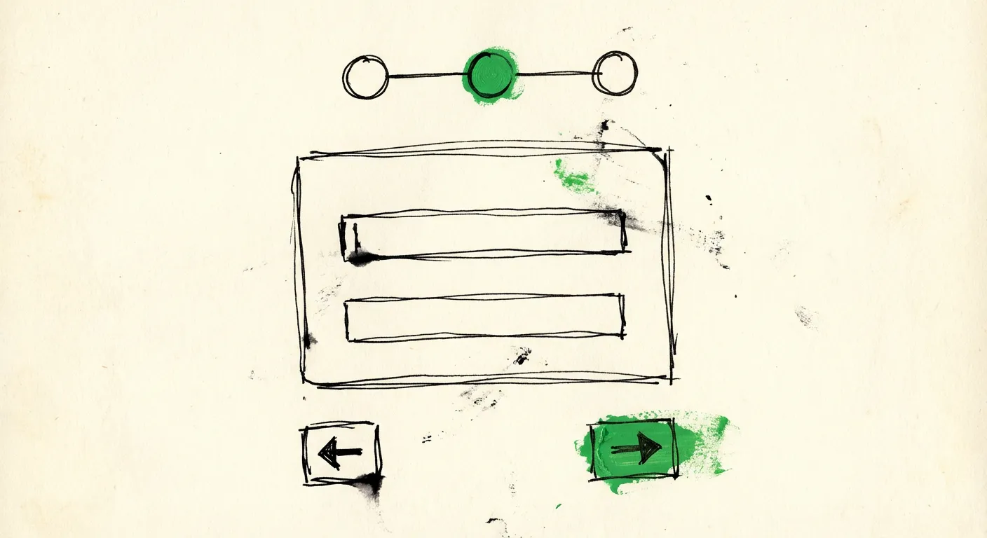
Multi-Step Form Design: UX Patterns That Convert
Break long forms into digestible steps. Progress indicators, validation timing, and mobile patterns that work.
Nobody wants to fill out a 15-field form. The moment users see a wall of inputs, their brain calculates the effort and decides whether it’s worth it. Most of the time, it isn’t. They bounce.
Multi-step forms solve this by chunking complexity into digestible pieces. Instead of overwhelming users with everything at once, you guide them through a sequence. Each step feels manageable. Progress feels tangible. And completion rates go up.
But here’s the thing: multi-step forms can also backfire spectacularly. Done wrong, they feel like an obstacle course. Users get lost, frustrated, or suspicious about how much more is coming. The difference between a form that converts and one that hemorrhages users often comes down to specific UX patterns.
Let’s break down what actually works.
When Multi-Step Makes Sense (And When It Doesn’t)
Before diving into patterns, a reality check: not every form needs multiple steps.
Multi-step works well for:
- Forms with 7+ fields
- Complex data collection requiring different input types (text, uploads, selections)
- Conditional logic where later questions depend on earlier answers
- Checkout flows and onboarding sequences
- Quote requests that need context before pricing
- Applications requiring multiple categories of information
Single-step is better for:
- Contact forms with 3-4 fields
- Newsletter signups
- Simple feedback forms
- Login and registration (unless you’re collecting profile data during signup)
- Quick surveys with 5 or fewer questions
The rule of thumb: if users can see all fields without scrolling on a typical screen, keep it single-step. The overhead of navigation and progress tracking isn’t worth it for simple forms.
The Anatomy of a Conversion-Focused Multi-Step Form
High-converting multi-step forms share common elements. Here’s what they typically include:
1. Progress indicator - Users need to know where they are and how much is left.
2. Step titles - Each step should have a clear, descriptive heading.
3. Field grouping - Related fields cluster together logically.
4. Navigation controls - Back and next buttons, positioned consistently.
5. Validation feedback - Immediate, helpful error messages.
6. Summary/review step - Optional but useful for complex flows.
7. Persistent context - Key information (like selected product or service) stays visible.
Let’s dig into each of these.
Progress Indicators: The Psychological Anchor
Progress indicators do more than show position. They set expectations and create commitment.
Research from the Endowed Progress Effect shows that people are more likely to complete tasks when they feel they’ve already made progress. A progress bar at 20% feels like momentum. Users think: “I’ve already invested time here, might as well finish.”
Types of progress indicators:
Step numbers - “Step 2 of 4” is the simplest approach. Works for any number of steps. Users know exactly where they are.
Progress bars - Visual and satisfying to watch fill up. Better for longer flows where you want to emphasize momentum. Can use percentage or just visual fill.
Breadcrumb navigation - Shows step names: “Contact → Company → Needs → Review”. Users can see what’s coming and sometimes navigate back to specific steps.
Checklist style - Each completed step gets a checkmark. Creates a sense of accomplishment and shows the full journey upfront.
Which to use?
For 3-4 steps: Step numbers or breadcrumbs work great.
For 5+ steps: Progress bars help because “Step 7 of 12” sounds exhausting.
For non-linear flows: Breadcrumbs let users jump to specific sections if you allow that.
Positioning matters. Top of the form is standard. Keep it visible without scrolling. Some designs fix the progress indicator at the top of the viewport during scroll.
// Example: Simple step indicator component
function StepIndicator({ currentStep, totalSteps, stepLabels }) {
  return (
    <div className="flex items-center justify-between mb-8">
      {stepLabels.map((label, index) => (
        <div key={index} className="flex items-center">
          <div
            className={`
              w-8 h-8 rounded-full flex items-center justify-center
              ${index < currentStep ? 'bg-green-500 text-white' : ''}
              ${index === currentStep ? 'bg-blue-600 text-white' : ''}
              ${index > currentStep ? 'bg-gray-200 text-gray-500' : ''}
            `}
          >
            {index < currentStep ? '✓' : index + 1}
          </div>
          <span className="ml-2 text-sm hidden md:inline">{label}</span>
          {index < totalSteps - 1 && (
            <div className="w-8 md:w-16 h-0.5 bg-gray-200 mx-2" />
          )}
        </div>
      ))}
    </div>
  );
}
Grouping Fields: The Logic of Steps
How you divide fields matters enormously. Bad groupings confuse users and make the form feel longer than it is.
Common grouping patterns:
By topic/category:
- Step 1: Personal information (name, email, phone)
- Step 2: Company details (company name, size, industry)
- Step 3: Project specifics (timeline, budget, requirements)
- Step 4: Review and submit
By complexity:
- Step 1: Quick wins (single-select options)
- Step 2: Text inputs (name, email, description)
- Step 3: Detailed fields (uploads, long-form text)
By commitment level:
- Step 1: Low commitment (industry, general interest)
- Step 2: Medium commitment (contact information)
- Step 3: High commitment (detailed requirements, uploads)
The last pattern—commitment escalation—is particularly effective. Users who provide low-commitment answers first are more invested by the time you ask for contact details. They’ve already started, so they’re more likely to finish.
Fields per step: Aim for 2-5 fields per step. One field per step feels tedious. More than 5 defeats the purpose of chunking.
Validation Timing: When to Show Errors
Validation timing can make or break the experience. Too early feels aggressive. Too late wastes user effort.
Three validation approaches:
1. On blur (when user leaves field) - Validates immediately after the user moves to the next field. Good for format validation like email and phone. Can feel aggressive for complex fields where users might tab away to check something.
2. On submit (when user clicks next) - Validates the entire step when user tries to proceed. Less interruptive but can dump multiple errors at once. Users have to scroll back up to fix issues.
3. Hybrid approach - Validate format on blur (is this a valid email?), validate required fields on submit. Best of both worlds.
The hybrid approach in practice:
// Validate email format immediately on blur
function validateEmail(value) {
  if (value && !/^[^\s@]+@[^\s@]+\.[^\s@]+$/.test(value)) {
    return 'Please enter a valid email address';
  }
  return null;
}

// Validate required fields only when trying to proceed
function validateStep(fields) {
  const errors = {};
  for (const [name, value] of Object.entries(fields)) {
    if (requiredFields.includes(name) && !value) {
      errors[name] = 'This field is required';
    }
  }
  return errors;
}
Error message placement: Inline errors directly below the field work best. Don’t rely solely on a summary at the top—users won’t connect it to the specific field.
Error message tone: Be specific and helpful. “Invalid email” is worse than “Please include an @ symbol”. “Required” is worse than “We need your email to send the quote”.
Navigation Controls: Back, Next, and Beyond
Navigation seems simple but has real impact on completion rates.
The basics:
- “Next” or “Continue” button on the right side
- “Back” or “Previous” on the left side
- Final step: “Submit” or action-specific label like “Get Quote” or “Create Account”
Button hierarchy: The primary action (Next/Submit) should be visually prominent. Back button can be secondary styling—users need it available but shouldn’t confuse it with the primary action.
Keyboard navigation: Tab order should flow naturally. Enter key should trigger the primary action when focused on the last field of a step. This matters more than you’d think for power users.
“Save and Continue Later” option: For long forms (insurance applications, job applications), offer a way to save progress. Email users a magic link to resume. This can recover abandonment from users who ran out of time, not interest.
<div className="flex justify-between mt-8">
  {currentStep > 0 && (
    <button
      type="button"
      onClick={handleBack}
      className="px-6 py-2 border border-gray-300 rounded text-gray-700 hover:bg-gray-50"
    >
      Back
    </button>
  )}

  <div className="ml-auto">
    <button
      type="button"
      onClick={handleNext}
      className="px-6 py-2 bg-blue-600 text-white rounded hover:bg-blue-700"
    >
      {currentStep === totalSteps - 1 ? 'Submit Request' : 'Continue'}
    </button>
  </div>
</div>
Mobile Considerations: The Thumb Zone
More than half of form submissions come from mobile devices. Multi-step forms need to work with thumbs.
Mobile-specific patterns:
Larger touch targets: Buttons should be at least 44x44 pixels. Input fields need comfortable tap areas. Nothing worse than tapping between two fields repeatedly.
Bottom-positioned navigation: Primary actions within thumb reach. Consider fixed bottom navigation bar for the Next button.
Single column layout: No side-by-side fields on mobile. Stack everything vertically.
Input type optimization: Use type="email" for email fields (triggers the @ keyboard), type="tel" for phone numbers (triggers number pad), inputmode="numeric" for numeric-only fields.
Auto-focus management: On mobile, auto-focus can trigger the keyboard to open unexpectedly. Be deliberate about when the keyboard appears.
// Mobile-friendly input with appropriate keyboard
<input
  type="email"
  inputMode="email"
  autoComplete="email"
  autoCapitalize="off"
  className="w-full px-4 py-3 border rounded-lg text-base"
  placeholder="you@company.com"
/>
Gesture considerations: Swipe-to-navigate between steps can feel natural on mobile, but don’t rely on it exclusively. Always provide visible buttons too.
Conditional Logic: Dynamic Steps
Some forms need to adapt based on earlier answers. “Which service are you interested in?” might determine which detail questions follow.
Implementation approaches:
Skip steps entirely: If someone selects “Individual” instead of “Business”, skip the company details step. Update the progress indicator to reflect the actual number of remaining steps.
Show/hide fields within steps: Keep the same steps but dynamically show relevant fields. A “Company size” dropdown appears only if “Business” was selected.
Branching paths: Different selections lead to entirely different step sequences. More complex to implement but sometimes necessary.
UX considerations for conditional forms:
- Always update the progress indicator when steps change
- Don’t make users re-answer questions if they go back and change an answer that affects the path
- Store all answers, not just visible ones—if they switch paths, restore previous answers
The Review Step: Building Confidence
Before final submission, a review step lets users confirm their inputs. This reduces errors and builds confidence that everything went through correctly.
Review step essentials:
- Show all submitted data organized by step
- Allow editing each section (clicking “Edit” jumps to that step)
- Clear final submission button
- Privacy reassurance (how their data will be used)
function ReviewStep({ formData, onEdit }) {
  return (
    <div className="space-y-6">
      <h2 className="text-xl font-semibold">Review Your Information</h2>

      <section className="border rounded-lg p-4">
        <div className="flex justify-between items-center mb-3">
          <h3 className="font-medium">Contact Details</h3>
          <button
            onClick={() => onEdit(0)}
            className="text-blue-600 text-sm hover:underline"
          >
            Edit
          </button>
        </div>
        <dl className="grid grid-cols-2 gap-2 text-sm">
          <dt className="text-gray-500">Name</dt>
          <dd>{formData.name}</dd>
          <dt className="text-gray-500">Email</dt>
          <dd>{formData.email}</dd>
        </dl>
      </section>

      {/* Additional sections... */}

      <p className="text-sm text-gray-500">
        By submitting, you agree to our privacy policy.
        We'll only use this information to respond to your inquiry.
      </p>
    </div>
  );
}
Common Mistakes That Kill Conversions
After seeing hundreds of multi-step forms, patterns emerge in what goes wrong.
1. Hidden step count - Users hate not knowing how long a form is. Always show total steps upfront. “Step 1 of ?” creates anxiety.
2. Inconsistent step length - If step 1 has 2 fields and step 2 has 8, users feel deceived. Keep steps roughly balanced.
3. Asking for sensitive info too early - Don’t request phone number or detailed budget on step 1. Build trust first. Low-commitment questions early, high-commitment later.
4. No back button - Preventing users from going back frustrates them and reduces trust. Let them review and edit.
5. Breaking on browser back - The browser back button should navigate to the previous step, not leave the form entirely. This requires proper history management.
6. Losing data on refresh - If users accidentally refresh or navigate away, their progress should persist. Use localStorage or server-side session storage.
7. Aggressive required fields - Not everything needs to be mandatory. Mark truly required fields, make others optional with “Optional” labels. Fewer required fields = higher completion.
8. Poor mobile experience - Tested on desktop only. Forms that work perfectly on desktop often fail on mobile with tiny touch targets and weird keyboard behavior.
9. Slow transitions - Fancy animations between steps feel sluggish after the first time. Keep transitions under 200ms.
10. Captcha friction - Visible captcha on every step or before final submission adds friction. Modern spam protection can work invisibly.
Invisible Protection: Keeping Spam Out Without Hurting UX
One thing that often tanks multi-step form conversions: intrusive spam protection. Captchas force users to prove they’re human right when they’re trying to complete an action. It breaks flow and causes abandonment.
The best spam protection is invisible. Your users shouldn’t know it’s there.
This means checking submissions server-side using signals like:
- Submission timing (bots submit instantly, humans don’t)
- Honeypot fields (hidden fields bots fill, humans don’t see)
- IP reputation and VPN detection
- Email validation (disposable emails, invalid domains)
- Content analysis for spam patterns
FormShield handles all of this behind the scenes. One API call checks multiple signals and returns a spam score. Your multi-step form stays clean—no captcha step, no friction, no weird challenges. Users just complete the form normally while spam gets filtered silently.
The key insight: every piece of friction in your form costs conversions. Spam protection that adds visible steps or challenges is working against your conversion goals. Invisible protection that happens server-side has zero impact on user experience.
Measuring Success: What to Track
You can’t improve what you don’t measure. For multi-step forms, track:
Completion rate - Total submissions ÷ Total form starts. Your north star metric.
Step-by-step drop-off - Where do users abandon? If 40% drop at step 3, that step needs attention.
Time per step - Unusually long times suggest confusion. Very short times might indicate skipping or abandonment.
Field-level errors - Which fields cause the most validation errors? They might need better labels or formatting.
Device breakdown - Compare mobile vs desktop completion rates. Big gaps indicate mobile UX problems.
Back button usage - High back-button rates might mean users are confused or want to change answers. Not necessarily bad, but worth investigating.
Set up event tracking for each step transition:
function trackStepCompletion(stepNumber, stepName, timeOnStep) {
  analytics.track('form_step_completed', {
    step_number: stepNumber,
    step_name: stepName,
    time_on_step: timeOnStep,
    device_type: isMobile() ? 'mobile' : 'desktop'
  });
}
Putting It All Together
Here’s a checklist for your next multi-step form:
Planning:
- Is multi-step actually necessary? (7+ fields, complex data, conditional logic)
- Fields grouped logically by topic or commitment level
- 2-5 fields per step, balanced across steps
- Low-commitment questions first, contact details later
Progress & Navigation:
- Clear progress indicator showing current step and total
- Descriptive step titles
- Back button on every step (except first)
- Primary action button visually prominent
- Final button text matches the action (“Get Quote” not “Submit”)
Validation:
- Inline validation on blur for format errors
- Required field validation on step submit
- Helpful, specific error messages
- Errors positioned directly under fields
Mobile:
- Single column layout
- Touch-friendly input sizes (44px minimum)
- Correct input types for keyboard optimization
- Navigation buttons within thumb reach
Data & State:
- Progress persists on refresh
- Browser back button navigates steps correctly
- Conditional logic updates progress indicator
- Review step before final submission
Protection:
- Invisible spam detection (no captcha)
- Honeypot fields as backup
- Server-side validation
Multi-step forms convert when they respect user attention and reduce cognitive load. Each step should feel quick. Progress should feel tangible. And nothing should interrupt the flow—especially not spam protection.
Get the patterns right, and you’ll see completion rates climb. Get them wrong, and you’re just creating a more elaborate way for users to abandon.