Reducing Form Abandonment: Why Users Leave and How to Fix It
81% of users abandon forms. CAPTCHAs, long forms, and trust issues are killing your conversions. Here's how to fix it without sacrificing spam protection.
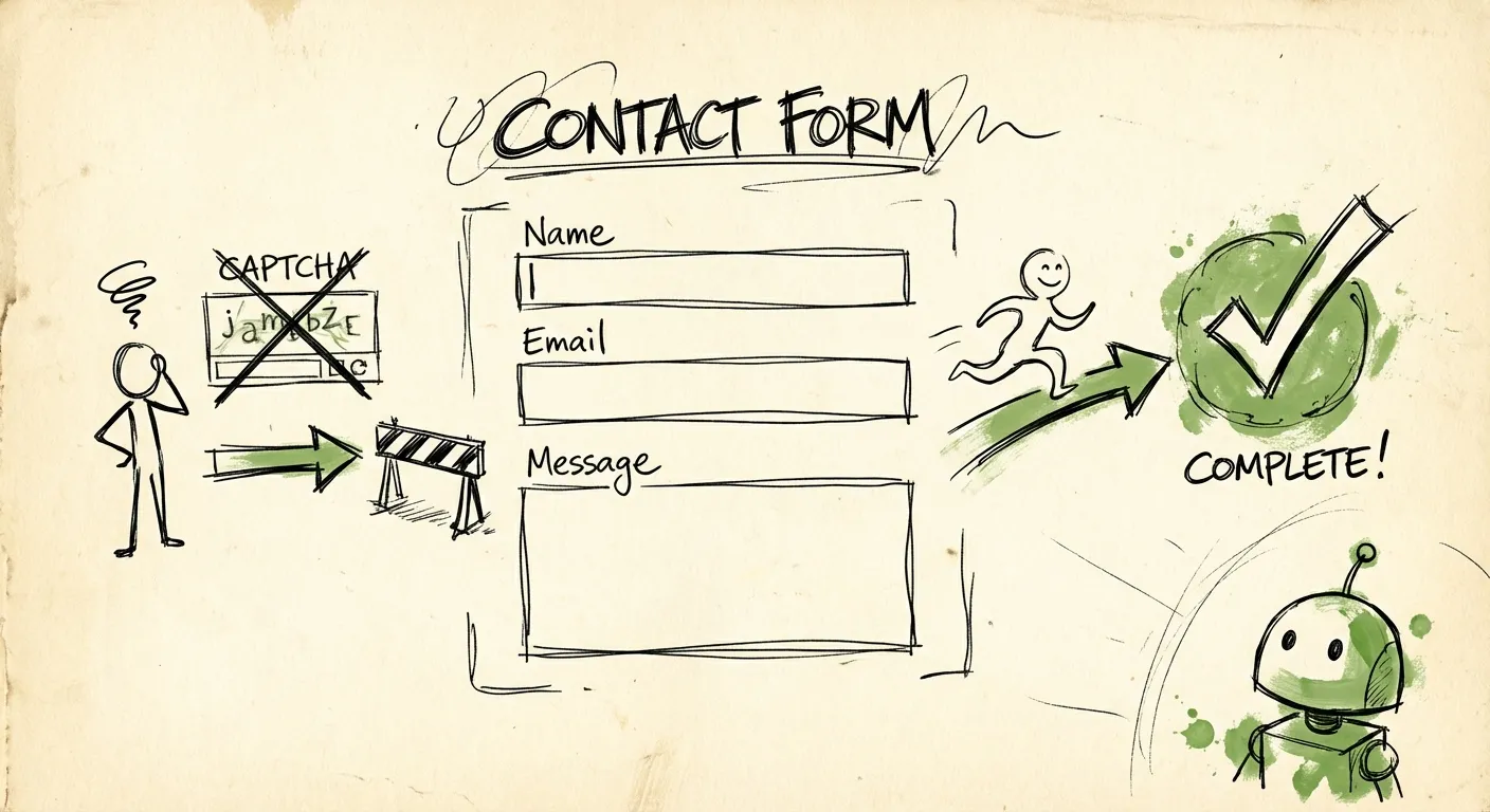
Your contact form is hemorrhaging leads. Right now, as you read this, someone is halfway through your form, cursor hovering over the submit button. They’re about to close the tab.
Not because your offer isn’t compelling. Not because they changed their mind. But because something about your form made them feel uncomfortable, impatient, or suspicious.
81% of people have abandoned a form after starting to fill it out. The average person bails after just 1 minute and 43 seconds. And about a third of everyone who starts your form never finishes it. That’s a lot of potential customers quietly clicking away.
The good news? Most form abandonment is fixable. The causes are well-documented, and the solutions aren’t rocket science. You just need to know where to look.
The Real Reasons People Abandon Forms
Before we fix anything, we need to understand why users leave. And no, it’s not because they’re lazy or distracted (well, sometimes it is, but that’s not the core issue).
Security concerns top the list at 29%. Users worry about what happens to their data. Who gets their email? Will they be spammed? Is this site even legitimate? That little voice in their head says “maybe not worth it.”
Form length comes second at 27%. Every field is friction. Every required input is a micro-decision. And at some point, the accumulated friction outweighs the perceived benefit of completing the form.
Unnecessary questions cause 10% of abandonments. Users know when you’re asking for information you don’t actually need. “Why do they need my phone number for a newsletter signup?” They smell data harvesting, and they bounce.
Ads and upselling tank 11% of completions. Nothing screams “we don’t respect your time” like a popup appearing while someone’s trying to submit a form. Or a sudden upsell page between form steps.
These aren’t guesses. These are documented patterns across millions of form submissions. And they all point to the same underlying problem: friction.
CAPTCHAs: The Conversion Killer You Think You Need
Here’s where things get interesting. You’ve got a spam problem. Bots are flooding your inbox with junk submissions. The obvious solution? Add a CAPTCHA. Make users prove they’re human.
Except CAPTCHAs are conversion killers in disguise.
A Stanford study found that CAPTCHA challenges can reduce form conversions by up to 40%. Other research shows adding a CAPTCHA increases bounce rates by over 3.2% and depresses conversion rates by 3-5%.
That might sound small until you do the math. A site with a 3% conversion rate and 100,000 monthly visitors generates 3,000 conversions. A 3% drop from CAPTCHA friction means 90 fewer conversions per month. At a $100 average order value, that’s $9,000 monthly revenue lost to a spam protection measure that doesn’t even work that well.
Wait, what? CAPTCHAs don’t work?
Not against motivated attackers. Professional spam services use human solvers to bypass CAPTCHAs. They pay actual humans pennies to click traffic lights and crosswalks all day. Your CAPTCHA is friction for legitimate users while barely slowing down the spam professionals.
The numbers are brutal. In one case study, a form without CAPTCHA had a 64% conversion rate. The same form with CAPTCHA? 48%. That’s nearly one-third more conversions lost to “security.”
And it gets worse on mobile. Completing actions takes 30-40% more time with a CAPTCHA than without. Those tiny image grids are a nightmare to tap accurately on a phone screen. Studies show only 62% of users complete CAPTCHA on their first try. 15% give up entirely.
Reddit increased account creation by 8% simply by removing their CAPTCHA. That’s the kind of lift most companies dream about from major redesigns. And all they did was remove an obstacle.
Form Length: The Goldilocks Problem
“Keep it to five fields or fewer.” You’ve heard this advice. It’s become UX gospel.
But it’s also an oversimplification that can lead you astray.
Yes, every field adds friction. Research shows that asking for a phone number reduces conversion rates by 5%. Street address drops it by 4%. Age costs you 3%. These are real costs you pay for every field.
But here’s the nuance: removing fields that qualify leads means you end up with more spam and junk submissions. Your sales team wastes hours filtering garbage instead of closing deals. The “fewer fields always wins” logic breaks down when you account for lead quality.
The real question isn’t “how few fields can I get away with?” It’s “which fields are worth the friction?”
Essential fields stay. Name, email, message for a contact form. These earn their friction.
Nice-to-have fields get cut. Do you need company size on a first touchpoint? Probably not. Ask later.
Context-dependent fields get conditional logic. Show the phone number field only after they indicate they want a call. Don’t force everyone through fields that only apply to some users.
Make sensitive fields optional. 37% of people abandon forms asking for their phone number. But if you make that field optional, completion nearly doubles. Same information available, drastically different conversion rates.
One more trick: ask for less granular data. Instead of full address, just ask for ZIP code. Instead of exact budget, offer ranges. The information is still useful, but the friction drops significantly.
The Trust Gap: Why Users Don’t Believe You
Security concerns cause 29% of form abandonments. Users don’t trust you with their information. And honestly? They shouldn’t automatically trust any website asking for personal data.
Building trust is your job, and it starts before users even reach the form.
SSL certificates are table stakes. That padlock icon in the browser bar is the bare minimum. If you don’t have HTTPS, you’re signaling that you don’t take security seriously.
Trust badges actually work. Research shows forms with security badges see 42% more conversions than those without. Blue Fountain Media increased form conversions by 42% just by adding a Verisign trust badge.
But not all badges are equal. The Norton Seal, Google Trusted Store, BBB Accredited Business, and McAfee Secure consistently rank as the most trusted badges for US consumers. Random “guaranteed secure” graphics don’t carry the same weight.
Placement matters as much as presence. Put badges near form fields where users enter sensitive information. Above the submit button. Near credit card or personal information fields. Users need reassurance at the moment of hesitation, not just somewhere on the page.
Privacy statements reduce anxiety. A simple “We’ll never share your email” line near the email field addresses the specific concern users have at that moment. 12% of people abandon checkout forms specifically because there are no trust badges or privacy indicators.
But don’t overdo it. Too many badges creates visual noise and can look desperate. Stick to 3-5 impactful badges at key conversion points.
Mobile: Where Form Abandonment Goes to Die
Over 58% of web traffic comes from mobile devices. And mobile cart abandonment rates hit 80.2%. Your desktop form might convert fine, but mobile is a completely different challenge.
Touch targets need to be at least 48x48 pixels. Thumbs are imprecise. Tiny form fields and buttons cause mis-taps and frustration. Every failed tap is a micro-annoyance that accumulates toward abandonment.
Single-column layouts only. Multi-column forms might look efficient on desktop. On mobile, they force horizontal scrolling or create cramped fields. Stack everything vertically.
Use the right input types. When a field expects a phone number, use type="tel" to trigger the numeric keypad. For email, use type="email" to get the @ key. These tiny details make mobile forms dramatically faster to complete.
Enable autofill. Browser autofill increases mobile completion rates by 25% and makes the process 30% faster. Use proper autocomplete attributes so browsers can pre-fill name, email, address, and payment details. Users love not typing on tiny keyboards.
And about those CAPTCHAs we discussed earlier? They’re even worse on mobile. Image-selection CAPTCHAs take an average of 9.8 seconds to solve on desktop. On mobile, add another 30-40% to that time. Audio CAPTCHAs take a staggering 28.4 seconds.
Recovery Strategies: Getting Abandoners Back
Some abandonment is inevitable. Users get distracted. Phones die. Life happens. But a chunk of those abandoners can be recovered with the right strategies.
Capture partial form data. Modern form tools can capture field inputs before submission. If someone fills in their email but abandons before completing, you have a recovery opportunity.
Timed follow-up emails work. 19% of people will return to complete a form if the company reaches out. Timing matters - sending a recovery email one hour after abandonment yields a 16% conversion rate. Wait a day and it drops to 11%.
Save and continue later functionality. For long forms, give users an option to save progress and get a link to resume. This captures users who ran out of time, not interest. A simple “We’ll email you a link to continue” can recover submissions that would otherwise be lost.
Personalize recovery messages. Generic “You left something behind” emails are better than nothing. But personalized messages referencing their specific interests or selections convert significantly better. If they were looking at a specific product, mention it.
Consider SMS or messaging apps. Email open rates are declining. Recovery messages via SMS or WhatsApp can cut through inbox noise. But be careful - this only works if users expect communication on these channels.
Validation That Helps Instead of Hurts
Nothing tanks completion rates faster than aggressive validation. You know the experience: carefully fill out a form, hit submit, page reloads with a cryptic red message at the top, and now you have to hunt through 12 fields to find the one that failed.
This is “submit-and-pray” validation, and it’s terrible.
Research on inline validation shows dramatic improvements: 22% increase in success rates, 22% decrease in errors, 31% increase in satisfaction, and 42% faster completion times.
But inline validation has a trap. Validate too aggressively and you interrupt users mid-thought. Nothing’s more annoying than seeing “Invalid email” flash while you’re still typing your email address.
The solution is the “reward early, punish late” pattern:
- Validate on blur (when users leave a field), not on keystroke
- Show success states immediately - that green checkmark is motivating
- Delay error messages until users have finished typing
- Clear errors in real-time once the user fixes the issue
And please, be flexible about formatting. Your phone number field should accept (555) 123-4567 and 5551234567 and 555-123-4567. Don’t make users guess which format you want. Parse the input and normalize it yourself.
Error messages should be human. “Invalid input” tells users nothing. “Please enter a valid email address like name@example.com” actually helps.
The Multi-Step Approach
When forms genuinely need a lot of information, breaking them into steps can dramatically improve completion rates. Instead of showing 15 fields at once, you show 3-4 at a time with a progress indicator.
This works because of psychology, not just aesthetics.
Reduced cognitive load. Users focus on one small task instead of parsing an overwhelming wall of inputs.
Commitment escalation. Once someone completes steps 1 and 2, they’ve invested effort. They’re more likely to finish than abandon.
Perceived simplicity. A 5-step form with 3 fields each feels lighter than a single page with 15 fields. Even though it’s the same total fields.
But don’t over-engineer it. If your form genuinely needs 5 fields, just show 5 fields. Multi-step adds navigation overhead. The benefit only kicks in when you’re managing genuine complexity.
For detailed patterns on multi-step implementation, check out our guide on multi-step form design.
Invisible Spam Protection: The Best of Both Worlds
Here’s the core tension: you need spam protection. Bots and spam services will flood an unprotected form within days. But traditional spam protection (CAPTCHAs, challenge questions, math problems) adds friction that kills conversions.
The solution is protection that works behind the scenes. Users never see it, never interact with it, never get frustrated by it.
Honeypot fields are the simplest approach. Add a hidden field to your form that legitimate users can’t see. Bots fill it automatically, flagging themselves as spam. Zero user friction because users literally don’t know it’s there.
Timing analysis catches bots that submit instantly. Humans take time to read, think, and type. A submission that happens 0.3 seconds after page load? That’s not a human. No user interaction required to detect this.
IP intelligence identifies suspicious sources. VPN and datacenter IPs are higher risk. Known spam IPs get blocked. Geographic anomalies raise flags. All happening server-side, invisible to users.
Email validation catches disposable addresses and spam traps. Invalid MX records, temporary email services, known spam domains - all detected without asking users to prove anything.
Behavioral signals analyze patterns bots can’t fake. Mouse movements, scroll behavior, field focus patterns. Humans behave differently than scripts, and those differences are detectable.
FormShield combines all these signals into a single API call. You submit the form data, get back a spam score and detailed breakdown. Block spam silently, let legitimate users through without friction.
The behavioral detection is particularly useful. FormShield tracks submission timing and honeypot interactions without requiring users to prove anything. A human filling out a form behaves differently than a script or spam service. Those patterns are invisible to users but obvious to the detection system.
No CAPTCHAs. No puzzles. No “click all the traffic lights.” Just invisible protection that doesn’t cost you conversions.
The Quick Wins
If you’re looking for immediate improvements, start here:
-
Remove your CAPTCHA. Replace it with invisible protection like honeypot fields or FormShield. The conversion lift alone usually justifies the change.
-
Add trust badges near your form. Norton, McAfee, or SSL badges positioned near sensitive fields. Quick to implement, meaningful impact.
-
Make phone number optional. If you’re requiring it, you’re losing 37% of potential completions. Make it optional with a note like “We’ll only call if you request it.”
-
Audit mobile experience on an actual phone. Not browser dev tools. An actual phone with your actual thumb. Tap every field. Complete the form. Feel the friction.
-
Add inline validation on blur. Show errors after users leave a field, not while typing. Show success checkmarks immediately.
-
Add a privacy statement near the email field. “We’ll never share your email” or “No spam, we promise” addresses the specific anxiety users feel at that moment.
Each of these changes should improve completion rates independently. Stack them and the compound effect gets significant.
Measuring What Matters
You can’t fix what you don’t measure. For forms, track:
Completion rate - Total submissions divided by total form starts. This is your north star.
Field-level drop-off - Which specific field causes the most abandonments? Analytics tools like Hotjar can show you exactly where users bail.
Time to completion - How long does the average submission take? Unusually long times suggest friction. Unusually short times (sub-5 seconds) might indicate bot traffic.
Device breakdown - Compare mobile vs desktop completion rates. A big gap means mobile UX problems.
Error rates by field - Which fields cause the most validation errors? They probably need better labels, formatting flexibility, or removal.
Set up event tracking for form starts, field completions, validation errors, and submissions. The data will tell you exactly where to focus your optimization efforts.
The Bottom Line
Form abandonment isn’t mysterious. It’s the predictable result of friction accumulating until users decide completing your form isn’t worth the effort.
Security concerns, form length, unnecessary questions, and friction-adding spam protection are the main culprits. And they’re all fixable.
The hardest mental shift is recognizing that spam protection can work invisibly. Years of CAPTCHAs have conditioned us to think spam prevention requires user interaction. It doesn’t. Modern detection techniques analyze behavior, reputation, and signals that users never see.
Your forms can be clean, simple, and friction-free while still blocking spam effectively. The technology exists. You just have to use it.
Start with the quick wins. Measure the impact. Iterate from there. Every percentage point of improvement means more leads, more customers, more revenue from the same traffic you’re already getting.
That’s the real ROI of fixing form abandonment. Not just better UX metrics, but actual money you’re currently leaving on the table.
Ready to stop losing conversions to spam protection friction? See how FormShield works or start your free trial to test invisible spam detection on your forms.